 BBC World is hosting an INTERACTIVE MAP ON URBAN GROWTH Check it out and watch the world's largest cities grow in population numbers between 1955 and estimates for 2015.
I love interactive maps but all this one does is feed into the overpopulation scare. The authors even use the world "explosion" in their intro! You get to see the shear numbers of people that now live in these urban areas but you don't get to find out where exactly they've come from (rural areas vs population increase vs international migration vs ???) and you don't get to know about corresponding standards of living increases, national economic growth, employment rates or whether or not services and housing exists for these growing urban areas.
Instead, it's a CRAZY explosion of people. AHHH, freak out! There are too many bodies!! But what about the ideas, the freedoms, the diversity, the creativity and the other benefits of urbanism. The map tells us nothing about these things.
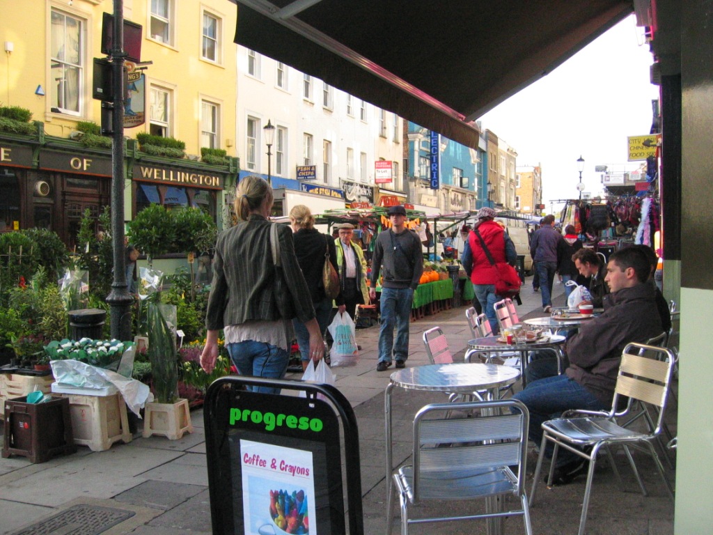
PHOTO: Portabello Road, London, UK, November 2005.

No comments:
Post a Comment